Typography for bloggers 101

Buying a theme for your blog doesn’t mean that you have to stick to using their exact fonts and colors. Most themes allow you to customize however you please, as long as you don’t delete the little snippet that states where the theme comes from (which is usually on the footer). So you want to customize your blog and change the fonts, but don’t know where to start? How do you combine fonts in a way where your blog is readable and aesthetically pleasing?
Understanding serif vs. sans serif
There are two main types of typefaces: the serif and the sans serif.
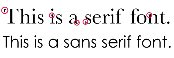
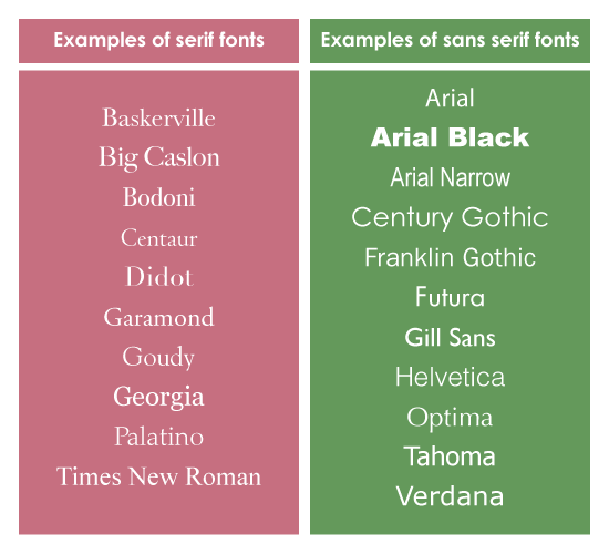
The serif font is usually what’s used in newspaper body text, and what you think of when you see old school print materials. Each letterform in a serif font has a stroke on each edge. Normally, serif fonts are preferred for large bodies of text because they are easier to read, but there are studies that show that there is no difference. And honestly, I break this rule too: For my blog body text, I use Century Gothic (sans serif) and each post title, I use Baskerville (serif). Times New Roman is the most well-known serif font.
The sans serif typefaces are cleaner, more modernized and are usually associated with computer text. Usually, sans serif fonts are best used for headlines and smaller bodies of text. Arial and Helvetica are most well-known among sans serifs. The font Impact is also known for its use in memes.
The best way to make your blog (or whatever you design, whether you are a graphic designer or you do some design work on the side) look interesting yet still clean is to combine a sans serif or a serif font. Never ever use more than two or three fonts, because that starts to cause chaos.
There are also monospaced (which look like the characters that came from a typewriter), decorative and script fonts too, but they are used sparingly and for “fun” design materials (such as posters, birthday cards, invitations…)


Finding web-safe fonts
According to PSD2HTML, there are only five universal fonts: Arial, Courier New, Georgia, Times New Roman and Verdana. This means that almost all computers, Mac or PC, will have them. So if you use any of those fonts, they are guaranteed to show up on other computers.
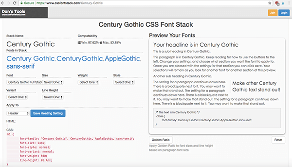
There are a whole host of other web-safe fonts, but the fab five listed above are your safest bet? Now, how do you know if your font of choice if web-safe or not? I go on CSS Font Stack to check. Futura is my FAVORITE font, but I cannot use it for this blog because of its incompatibility with PCs (only 1.26% of PC computers will show Futura vs. the 94.41% of Mac computers). Like I mentioned earlier, I use Century Gothic for my body text, which is compatible for 87.62% of PC computers and 53.15% of Mac computers. Notice how the fab five fonts at least 95% web-safe for both Mac and PCs.

Notice in the screenshot above, there’s a list of fonts under the “Fonts in Stack” section: Century Gothic, CenturyGothic, AppleGothic, sans-serif. That means that you have to copy and paste that whole list of fonts when you’re changing your fonts in CSS. The fonts listed AFTER your first font choice are called “fallback fonts”. If your computer does not have or read Century Gothic, my blog text will show AppleGothic instead. Then, if you don’t have AppleGothic, your computer will pull up any sort of sans serif font on my blog. Usually, fallback fonts are most similar in appearance to the original font you chose.
Customizing your fonts through the CSS editor
So once you have your Font stack, copy and paste it to the CSS Editor (For Blogspot, click on “Theme” on the left sidebar, then click on the “Edit HTML” button. For WordPress, click on “Appearance”, then click on “Editor”). Look for the body selector. It should look like this:
body {
font-family: “Century Gothic”, CenturyGothic, AppleGothic, sans-serif;
font-size: 14px;
font-weight: 400;
line-height: 1.8em;
color: #000000;
background-color: #ffffff;
padding: 0;
position: relative;
Then all you have to do is past your font stack after where it says “font-family”. That’s it! The font-family, font-size, font-weight, etc. are called properties, which allows you to change the size, spacing, and weight of the fonts. The properties allow you to customize absolutely anything. For a list of CSS properties, click here.
If you want to change the blog title, links, sidebar text, etc., look for the selectors. These are examples of selectors:
h1 {
.widget-title {
a:link {
And each selector will have properties (mentioned above), which gives you the capability to customize your text as you please.
I hope these typography tips help you so that you can add your own unique touch to your blog!

Hannah is a travel writer, graphic designer, and the founder/editor of Hannah on Horizon. She is based in Sacramento, California, living with her husband and two adorable dogs. She shares tips on how to experience luxury travel on any budget, and how to maximize time at each trip or destination, no matter what your budget or amount of vacation time at work. She enjoys making you feel like you have visited each destination with her through her storytelling and informative writing style.
